Rapid prototyping, individual case study, Hyper Island UX upskill program
Simplify a Swedish payment app, improve experiences & make it more inclusive for the elderly generation
Background and problem space
In November 2020 SCB (Statistics Sweden) published a report on usage of online shopping or services amongst the population 2020. The report shows that people between 75 and 85 have increased in number during the last year by 10% (from 16 to 26%). Corresponding numbers in the span between 65 and 75 have increased from 40 to 47%. Worth noticing is also that 2 of 10 between 75 and 85 years old have never used internet. An important question is: how might we make it easier for them on digital services?
I personaly believe that we need to strive towards age equality, especially in digital channels. The pandemic more or less forced the seniors to shop online. How can we help them and improve their digital journey? Can a light version of Klarnas’ app help them on the way? Let’s check it out!
Persona
Meet Anne-Marie
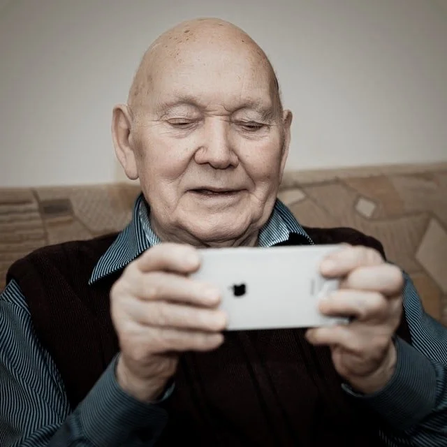
Ann-Marie is one of the new users of Klarnas’ online payment service. Ann-Marie is 78 years old, she lives with her husband Carl in their house in a suberb of a major city in the south of Sweden. They have three children, eight grand children and a dog that they walk every day along the beach. Their life has been good so far, they are luckily spared of severe sicknesses, maybe partly due to their daily walks, but the pandemic feels quite stressful for them.
When everything turned even worse during the pandemic they decided to start shopping online instead of visiting shopping centers. One of their biggest doubts about online shopping was the feer of being skimmed when using credit cards online. There are a lot of freightening stories, and it felt overwhelming getting knowledge on dealing with that, so Lena, their youngest daughter, recommended them to use Klarnas’ payment service. Easy and safe!
Ann-Marie can agree with the feeling of safety. If more than 85 million people use the service worldwide, then it must be reliable. But she has problems finding her way in the app, there are so many functions that she doesn’t understand, she feels really lost and a bit worried that she might fail to admit a payment by misstake. She only wish there would be an app that delivered on Easy, and Smooth as the brand promise.
And it looks so trendy, she doesn’t fully understand the language and the images. Could there maybe be a slimmed app, for us in the silver generation that gets stressed from to much choices and animations? Now when we seniors – more than anyone – need to shop online to avoid Covid 19.
Reflections: Splash screen
– The images and animations on the splash screen speak to a younger audience, but how does it feel for the seniors?
– White text on pastel colors can be hard to read and is not inclusive for all users.
Reflections: Home screen
– Three different menues, in some cases also presented more than once, might confuse and build frustration for the user.
– The user might feel overwhelmed and confused by shops they didn’t expect. The copy might be considered as non-inclusive for seniors.
Reflections: My Klarna
– A number of alternatives to shop and to pay. Some are presented more than once.
QUESTIONS
– Could this be done in a slimmer version?
– Are there users that only want to see a small part of this? What do they want in that case?
– Would that be perceived as less stressful, frustrating and overwhelming?
– What is need to have, nice to have, not wanted at all?
Build empathy through storytelling
Testing the user journey with a lofi prototype made in Axure
I wanted to test the user journey from start screen, logging in with bank-id, finalizing a payment and log out. I tested it on zoom on a medium digital experienced couple that is 80 years plus.
“Confusing, where am I?”
“There are som many choices…”
“This is too much for me. If I should use it, I would only want Payments 340 kr. That’s enough for me.”
“What is the difference between these options?”
It took quite a while for the user to land on payment options, and to read all different choices. Frustrating. And then it was very stressful for them to find out how to log out, that button is well hidden and needs to be easier to find. We also realized that if you do not log out you could still be logged in 24 h later. That feels insecure for a bank app.
Card sorting – user test
at “My Klarna” screen
Testing what users felt was needed, nice to have or not needed, with a purpose to slim the app and make it easier to use.
“We don’t buy with part payment. Our generation pays direct.”
“What’s the difference with all alternatives?”
QUOTES FROM THE TEST SESSION
Hifi prototype
Solution and main changes
Splash screen with a more meditative picture.
Jump direct into “My Klarna”, no shopping platform.
Fewer options, less confusing.
A log out button clearly positioned at “My Klarna” Home Screen.


